
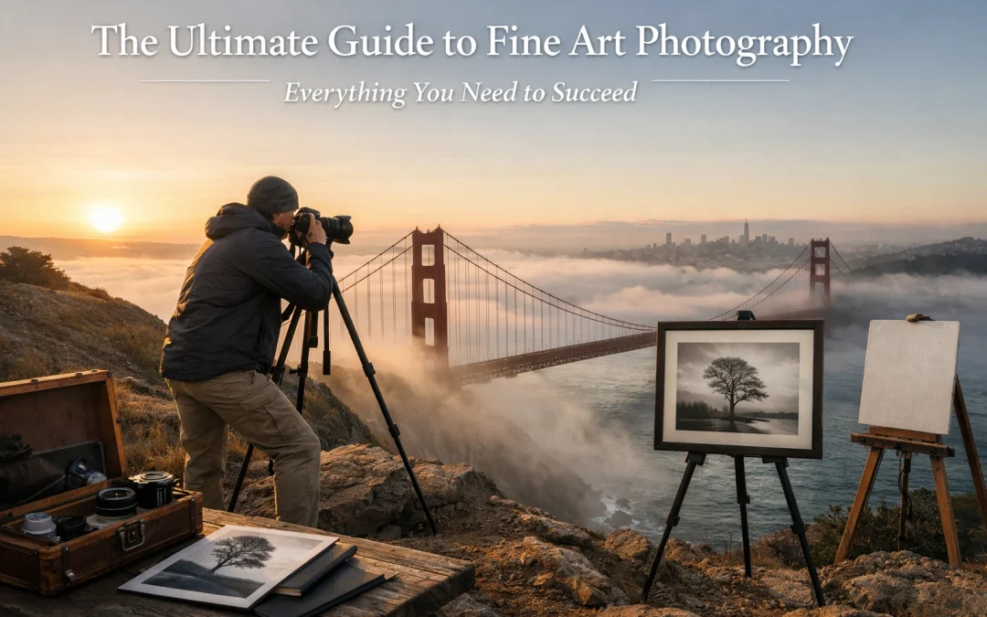
Many photographers can make a sharp photo, but fine art photography demands something bigger: you translate a feeling, a story, or a point of view into an image that holds attention like a well-composed painting. As you refine your craft, you’ll notice the gap between “nice shot” and “collectible artwork” comes down to three things you can fully control: intentional capture, consistent style, and museum-quality presentation.
If you want a clear path, you’re in the right place. You’ll learn how to build a cohesive body of work, dial in a signature look, and finish with archival prints that stand up to collectors, galleries, and time. For ongoing education and deeper dives, keep https://blog.edinchavez.com/ bookmarked, and if you want to see how finished fine art work is presented, explore https://www.edinfineart.com/ as a reference point for museum quality display standards.
What “fine art photography” actually means (and how you keep it from becoming vague)
As soon as you stop chasing “pretty” and start chasing “purpose,” your work becomes fine art photography. You’re not documenting what’s in front of you; you’re constructing meaning with light, timing, and design choices. That’s why the strongest fine art portfolios feel consistent even when the subjects change: your voice stays steady.
To keep your process concrete, anchor every project to one of these intent types:
| Intent type | What you’re communicating | What you control to make it land |
|---|---|---|
| Emotion-first | mood, solitude, tension, calm | contrast, color temperature, negative space |
| Concept-first | an idea (memory, decay, time, identity) | symbolism, repetition, visual metaphors |
| Place-first | a location with a point of view | time of day, perspective, atmosphere, scale |
| Form-first | shape, texture, abstraction | light direction, geometry, cropping discipline |
When you choose your intent before you shoot, you stop collecting random good images and start building a body of work that reads like a series. Hence, you gain consistency without forcing it.
Master the technical core (so your vision stays in charge)
The fastest way to make your art feel expensive is to make it feel controlled. When your exposure, focus, and tonality are deliberate, your viewer relaxes and pays attention to the message instead of the mistakes.
1) Exposure control: your “look” starts in-camera
Because fine art photography leans heavily on atmosphere, you should treat exposure as a creative decision: not a rescue mission in post.
- Aperture controls depth and separation. If you want a painterly falloff, you use wide apertures intentionally, not automatically.
- Shutter speed controls emotion through motion. Crisp stillness feels formal; blur feels dreamlike or uneasy.
- ISO controls texture. Clean files look polished; controlled grain can look timeless when you add it on purpose.
A reliable habit: expose for the highlights you refuse to lose, then shape the shadows later to match your intent. Your files become robust, and your editing becomes smooth as butter.
2) Light mastery: mood is a lighting decision
When you’re serious about museum quality results, you stop accepting “available light” as a limitation and start treating light as your main material.
- Side light gives depth and texture: perfect for landscapes, architecture, and still-life work.
- Backlight creates glow, haze, and separation: perfect for poetic, cinematic frames.
- Overcast light flattens contrast: perfect when you want gentle tonality and soft transitions.
With these lighting choices, you’re not just recording a scene: you’re designing an emotional response.
3) Composition: you guide the viewer’s eyes like a curator
Rule of thirds, leading lines, symmetry: those are tools, not laws. What ensures your images read as fine art is intentional placement and clean edges.
Use this simple checklist before you press the shutter:
- What is the subject really (not “a tree,” but “isolation”)?
- Where does your eye land first, and is that correct?
- Are the frame edges clean, or are they leaking attention?
- Is the background supporting the subject or competing with it?
This commitment to composition translates directly into prints that feel deliberate on a wall.
Develop a distinctive visual style (without copying anyone)
Your style is your consistency across variables: subject, season, location, lens choice. To develop it faster, you need repeatable decisions: especially in color and tonality.
A practical way to tighten your look is to standardize your starting point in Lightroom. That’s why a curated preset workflow is so powerful: it gives you a consistent base so your creativity goes into nuance, not rebuilding your look every time. If you want a pro-grade foundation that’s designed for cohesive fine art series, use the Ultimate Lightroom Preset Collection here: https://blog.edinchavez.com/product/ultimate-lightrooom-preset-collection/.
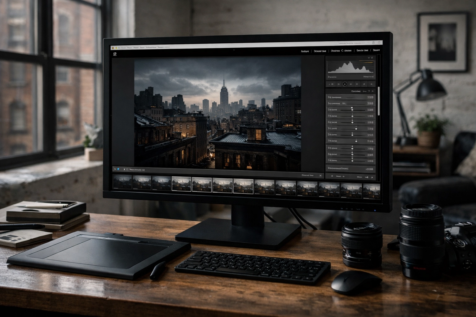
Alt text: Ultra-realistic behind-the-scenes view of a fine art photography editing setup in a New York studio, showing Adobe Lightroom with custom Lightroom presets applied to a moody cityscape; emphasizes consistent fine art photography color grading for museum quality prints.
A style-building framework you can actually follow
When you want your portfolio to look cohesive, lock these three “style anchors” for a full project:
- Tone curve direction: airy highlights vs. deep shadows
- Color bias: warm shadows/cool highlights vs. neutral vs. cinematic teal/orange
- Micro-contrast level: crisp detail vs. soft, painterly transitions
By integrating these anchors into every edit, you build a signature that viewers recognize instantly. Your work starts to feel like yours, even when you’re shooting new places.
Build a cohesive body of work (the difference between a portfolio and a collection)
A portfolio can be a greatest-hits gallery. A fine art collection is tighter: it has a theme, pacing, and visual continuity. When collectors buy, they’re often buying into a world: and your series is the doorway.
Choose a theme you can sustain
Your theme should be emotional or conceptual enough to produce variety, but focused enough to feel unified. Strong examples:
- “Quiet geometry in modern cities”
- “Coastal erosion and the shape of time”
- “Night light as a form of memory”
- “Botanical studies as abstraction”
Shoot like you’re building chapters
If you want the series to feel complete, plan for variety in your set:
- Establishing frames (wide, place-setting)
- Subject frames (the main motif)
- Detail frames (texture, pattern, abstraction)
- Transition frames (atmosphere, negative space)
With these considerations, you stop chasing single bangers and start building a story people can live with on their walls.
Advanced techniques that elevate fine art work (when used with restraint)
Just because you can do something in-camera or in post doesn’t mean it serves your intent. The best advanced techniques look invisible: they feel like the only way the image could exist.
Long exposure: make time visible
Long exposure turns movement into structure: clouds become brush strokes, water becomes glass, crowds become ghosts.
To get clean results:
- Use a solid tripod and a remote or timer
- Start at ISO 100 and tighten exposure with ND filters
- Keep highlights under control so your print doesn’t look “burned out”
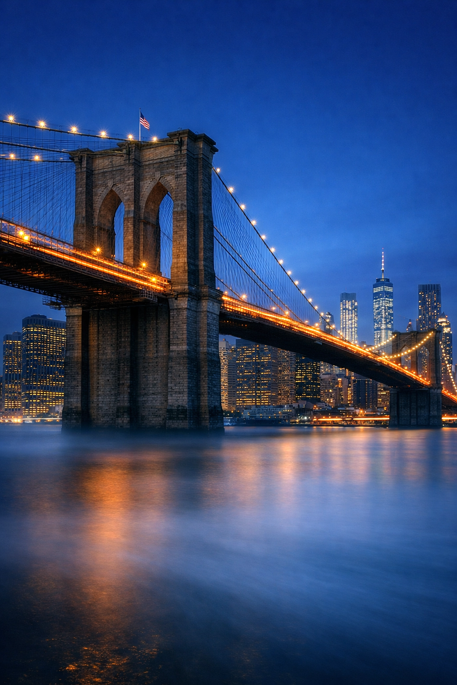
Alt text: Ultra-realistic long exposure fine art photography of the Brooklyn Bridge at blue hour in New York City, with smooth car light trails and crisp architectural detail; demonstrates fine art photography technique and museum quality tonal control.
HDR: dynamic range without the “HDR look”
HDR stands out as a tool when you use it for realism, not crunchiness. You bracket exposures to protect highlights and preserve shadow detail, then blend subtly so the scene looks natural but more readable.
Your rule: if your viewer notices the HDR, you pushed it too far.
In-camera creativity: ICM and multiple exposure
Intentional camera movement (ICM) and multiple exposure deliver painterly work when your concept supports abstraction. If your theme is memory, motion, or distortion, these techniques reinforce it and make the series feel designed.
Gear that actually matters (and what to ignore)
You don’t need the most expensive camera to create fine art photography, but you do need reliable files and sharp glass that holds up in print.
Prioritize what improves your final print
- Camera: a modern mirrorless/DSLR with solid dynamic range
- Lens: a sharp prime (35mm, 50mm, 85mm) or a pro zoom you trust
- Tripod: non-negotiable if you shoot long exposures or low light
- Filters: ND for long exposure; polarizer for glare control and richer skies
- Storage + backup: redundant drives so your work is protected
A quick gear-to-benefit table
| Gear choice | What it ensures for your art |
|---|---|
| High-resolution body | larger prints with cleaner detail |
| Sharp prime lens | micro-contrast that reads as premium in prints |
| Sturdy tripod | precise framing and clean long exposures |
| Color-calibrated monitor | edits that match your final archival prints |
When your gear choices are aligned to output, your workflow becomes efficient and your results become consistent.
Editing workflow for museum quality results (capture → refine → print)
If you want collectors to trust your work, your post-production has to be repeatable. You’re building a system, not gambling on “good edit days.”
A clean fine art editing pipeline
- Cull with intent: keep only images that serve your theme
- Global corrections: white balance, exposure, lens corrections
- Style pass: apply your Lightroom presets as a baseline, then refine
- Local control: dodge/burn for depth, guide the viewer’s eye
- Color management: soft proof for your paper/printer profile
- Export for print: correct resolution, output sharpening, and format
If you want your style to stay consistent across a series, use a preset baseline you trust, then customize per image. The fastest path is a professional toolkit like https://blog.edinchavez.com/product/ultimate-lightrooom-preset-collection/ because it keeps your work cohesive without flattening your creativity.
Printing like a pro: archival prints, papers, and presentation
Your image isn’t “finished” until it exists as a physical object. This is where fine art photography separates itself from content creation: your print quality becomes part of your signature.
What “archival prints” and “museum quality” mean in practice
When you present work as archival prints, you’re committing to longevity through:
- pigment-based inks
- acid-free, lignin-free papers
- controlled storage and handling
When you present work as museum quality, you’re signaling:
- excellent tonal separation (clean highlights, rich shadows)
- accurate color and skin tones (if relevant)
- professional finishing (borders, mounting, framing choices)
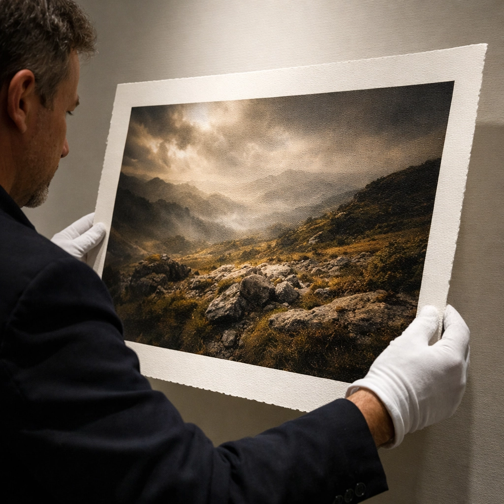
Alt text: Ultra-realistic close-up of a museum quality archival print being inspected under gallery lighting, showing fine art photography shadow detail and paper texture; highlights archival prints and professional presentation for collectors.
Paper choices that match your intent
- Matte fine art rag: soft, painterly, elegant: perfect for moody work
- Baryta/satin: deeper blacks and punch: perfect for contrast-heavy images
- Glossy: high impact but less forgiving: use when the concept demands pop
Your best move is to standardize one or two papers for a full series so your collection feels unified on the wall.
Present your work online like a collector would see it
Because most collectors meet your work on a screen first, your website presentation needs to feel clean, premium, and easy to navigate. A strong reference for professional fine art presentation is https://www.edinfineart.com/, where the emphasis stays on the artwork and the viewing experience remains seamless.
To support your brand ecosystem, keep your education hub and updates centralized at https://blog.edinchavez.com/, and if you offer services, workshops, or production support, connect that experience through https://edinstudios.com/. When your online presence feels coherent, your art feels more collectible by default.
A practical checklist: succeed in fine art photography by executing consistently
If you want a simple way to measure progress, use this checklist before you publish a new series:
- Your theme is clear in one sentence
- Your series has visual pacing (wide, medium, detail, transitions)
- Your color and contrast remain consistent across the set
- Your composition is clean at the edges in every frame
- Your edits follow a repeatable workflow (including Lightroom presets)
- Your final output is designed for archival prints and museum quality presentation
When you operate like this, you stop hoping your work stands out and start ensuring it does: through craft, consistency, and presentation that earns trust.


