
Just as a master chef wouldn't serve a five-star meal on a paper plate, you shouldn't let your hard-earned images suffer from poor printing choices. You’ve spent hours scouting locations, waiting for the perfect light, and perfecting your post-processing, yet when the physical print arrives, it looks… well, a bit "meh." It’s a heartbreaking moment that many photographers face, but it’s entirely avoidable.
Fine art photography is about more than just a digital file; it’s about the tangible experience of a physical piece. Whether you are selling your work to collectors or decorating your own home, the transition from screen to paper is where the magic: or the disaster: happens. To help you bridge that gap, I’ve rounded up the seven most common mistakes people make with fine art prints and, more importantly, how you can fix them to ensure your work achieves that coveted museum quality.
1. Starting with Low-Resolution Files
Many photographers make the mistake of thinking a "good looking" file on their laptop will automatically make a great 24×36 print. The reality is that pixels on a screen are far more forgiving than ink on paper. When you enlarge a low-resolution photograph for printing, you’re essentially asking the printer to "guess" where the extra detail should be, resulting in pixelation, soft edges, and a general lack of punch.
To fix this, you must work with high-resolution photographs at all times. This starts in-camera with RAW files and carries through your entire workflow. If you are aiming for archival prints that retain every ounce of detail, ensure your export settings are dialed in. For a truly professional finish, using the right tools during the editing phase is key. My Ultimate Lightroom Preset Collection helps you maintain that crisp, high-end look while streamlining your workflow so your files are always print-ready.
| Feature | Low-Resolution Impact | High-Resolution Benefit |
|---|---|---|
| Sharpness | Blurry edges and visible pixels | Razor-sharp detail and clarity |
| Texture | Loss of fine textures in shadows | Preserves the "feel" of the subject |
| Scaling | Limited to small sizes | Allows for large-format fine art prints |
2. Ignoring Color Calibration and Monitor Mismatch
Have you ever printed a photo only to find the colors are muddy, the shadows are pitch black, or the vibrant sunset has turned a weird shade of neon orange? This happens because your monitor isn't telling you the truth. Most consumer monitors are set too bright and too blue out of the box, which tricks you into making editing decisions that don't translate to paper.
By integrating a proper color calibration tool into your routine, you ensure that what you see on your screen is exactly what the printer produces. This commitment to accuracy is what separates hobbyists from pros. You need to calibrate your monitor at least once a month. Furthermore, when you are aiming for fine art photography excellence, you should be using ICC profiles specific to the paper you’re using. This ensures the printer understands exactly how that specific paper absorbs ink.
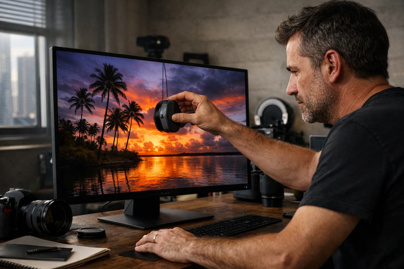
Alt Text: Professional photographer calibrating a high-end monitor in a dark studio setting to ensure color accuracy for fine art photography prints.
3. Photographing and Printing at the Wrong Angles (Keystoning)
This is a technical trap that catches even the best of us. When you are documenting your work or preparing a file that features architectural elements, failing to align yourself straight-on causes "keystoning." This is that annoying distortion where buildings appear to lean backward or the edges of your frame look warped.
The fix is simple but requires discipline: center yourself. Position your camera directly in the middle of the subject, ensuring the lens is at the same angle as the art or the horizon. Using a tripod is non-negotiable here. It stabilizes your camera and allows you to fill the frame perfectly without the wobble of unsteady hands. If you’re shooting landscapes for your next big print: perhaps a stunning Miami skyline: ensure your vertical lines are actually vertical. For more tips on getting those perfect Miami shots, check out the Miami Self-Driving Photography Guide.
4. Over-Editing and "Cooking" the Pixels
We’ve all been there: you get a little too excited with the saturation slider, and suddenly your landscape looks like it’s from another planet. While heavy editing might look "cool" on Instagram, it often falls apart in print. Excessive contrast and sharpness adjustments create unnatural-looking images that distract from the subject and quickly feel dated.
Collectors and galleries value restraint. Your goal should be subtle, timeless processing that preserves the integrity of the scene. Instead of pushing sliders to the max, focus on balanced exposure and natural color grades. This is where high-quality presets come in; they provide a consistent, professional base without destroying the underlying data of your image. This approach ensures your archival prints remain as beautiful 20 years from now as they are today.
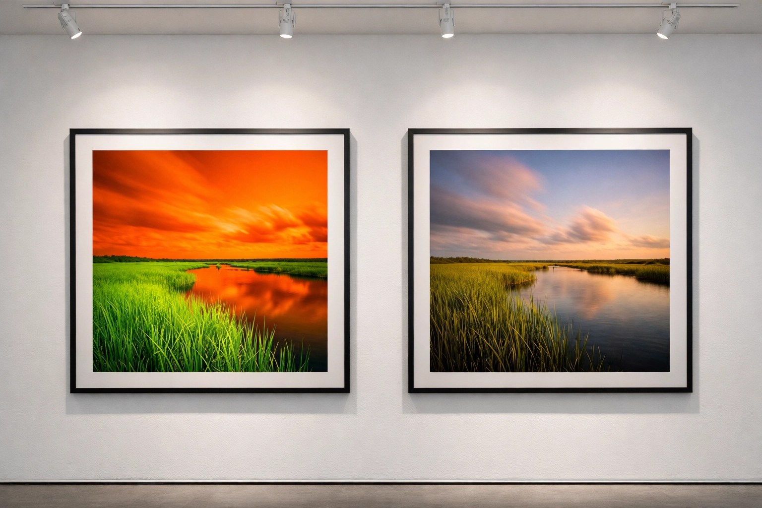
Alt Text: A side-by-side comparison of an over-saturated photo versus a tastefully edited fine art landscape print showing natural tones.
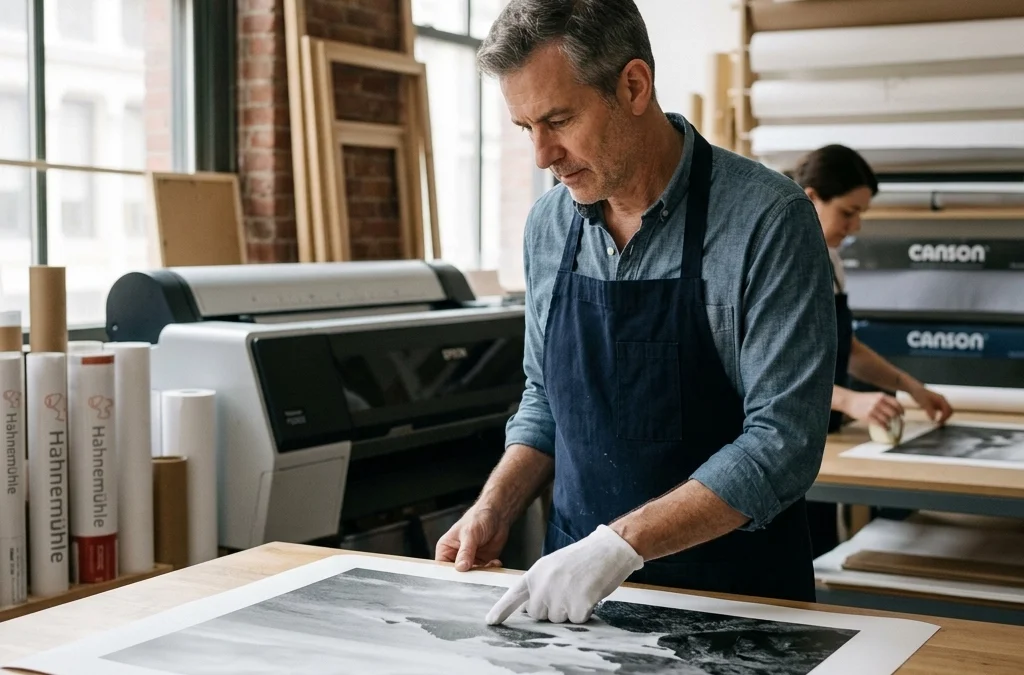
5. Choosing the Wrong Paper Type
Not all paper is created equal. Using standard "glossy" photo paper from a big-box store is a surefire way to make your work look cheap. Fine art photography demands better. The texture, weight, and "whiteness" of the paper significantly impact how the viewer perceives the work.
For a classic, high-end feel, you should look for acid-free, 100% cotton rag papers. These materials are what constitute a true museum quality print. They don't yellow over time, and they hold ink in a way that creates incredible depth. At Edin Fine Art, we take this very seriously, selecting only the finest materials to ensure every piece is a legacy item.
| Paper Type | Best For | Visual Effect |
|---|---|---|
| Cotton Rag (Matte) | Fine art, portraits, landscapes | Deep blacks, no glare, tactile feel |
| Baryta (Satin) | Black and white, high contrast | Traditional darkroom look, slight sheen |
| Metallic | Urban, night shots, water | High gloss, "popping" colors, reflective |
6. Neglecting the Environment and Display Lighting
You’ve got the perfect print on the perfect paper. You hang it up, and… you can't see it because of the glare from the window. Or worse, the colors start to fade after six months because it’s sitting in direct sunlight.
Your display environment is just as important as the print process itself. When hanging your work, consider the light source. To protect your investment, always use high-quality protective glazing (UV-protected glass or acrylic). This protects your prints from harmful light, humidity, and pollutants, preserving vibrancy for over 100 years. If you’re looking to capture more shots that deserve this kind of treatment, especially in the beautiful Florida wilderness, you’ll find my Everglades Photography Guide indispensable for finding that perfect light.
7. Skipping the Proofing Process
The final, and perhaps most common, mistake is going straight from screen to a large-format print without a test run. No matter how well-calibrated your monitor is, there will always be a slight difference in how light (on a screen) vs. pigment (on paper) behaves.
Always order a small "proof" print first. This allows you to check the shadow detail, the skin tones, and the overall "mood" of the physical piece. It’s a small extra step that saves you a lot of money and frustration in the long run. It ensures that when you finally commit to that massive gallery-wrapped piece, it is absolutely perfect.
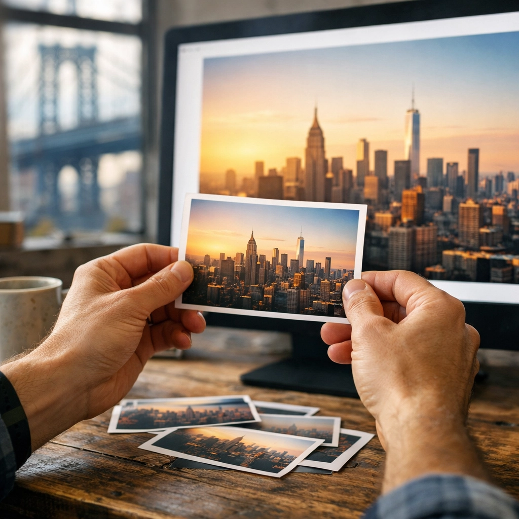
Alt Text: A photographer inspecting small 4×6 test prints against a large computer monitor to check for color consistency.
Elevate Your Work to Fine Art Status
Creating fine art photography is a journey that doesn't end when you click the shutter. It’s a meticulous process of refining your vision through editing and finally bringing it to life with archival prints. By avoiding these seven common pitfalls, you empower yourself to create work that doesn't just look good, but stands the test of time.
If you are ready to take your photography to the next level, whether you're shooting in the streets of NYC or the sunsets of Tahoe, having the right guidance makes all the difference. Check out the New York City Photography Guide or the Lake Tahoe Photography Guide to find the inspiration for your next masterpiece.
With these considerations, you are no longer just "taking pictures": you are creating art. For more insights on how to elevate your work, explore our site at Edin Studios or visit Edin Chavez Blog for a deep dive into hundreds of tutorials and guides. Your journey toward creating world-class prints starts with a single, well-informed step. Happy shooting!


